In this demo-rich talk Flex, Grid, and beyond: Mastering layouts with Tailwind CSS, Shruti Balasa shared an insightful exploration into the world of modern layout techniques. Her session centred on utilising Tailwind CSS, a utility-first CSS framework, to effectively construct responsive designs.

Embracing utility-first CSS for layout design
Shruti opened her presentation by advocating for the use of Tailwind CSS as a collection of “building blocks” for web design, likening them to “little Lego blocks that are readily available.” This analogy highlighted Tailwind’s strength in simplifying the layout creation process, providing developers with the necessary tools to easily assemble components without starting from scratch. She emphasised the accessibility of creating layouts through Tailwind’s utility classes, stating that “if something doesn’t fit, you just take it out… if you want something better, you take another piece, you fit that in.”
Additionally, Shruti characterised Tailwind’s component libraries as a vital resource for developers. With libraries such as FlowBite, DaisyUI, and Catalyst by Tailwind, “you can simply go to one of these component libraries” and easily find components styled with Tailwind CSS utility classes. This feature alleviates the burden of having to craft multiple utility classes from the ground up.
The productivity impact of understanding Flexbox and Grid layouts
Diving deeper into layout techniques, Shruti framed the presentation around five commonly encountered layouts, in both everyday web design and responsive environments. She underscored the significance of understanding both Flexbox and Grid systems as foundations for successful layout design. With practical demonstrations, she illustrated how knowledge of grid properties and flex algorithms can help to produce sleek and modern designs.
Advanced layout techniques for responsive design
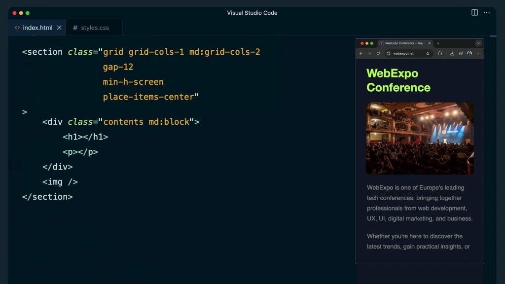
As the talk progressed, Shruti presented a series of advanced techniques applicable to responsive design. She reminded the audience of the necessity to create user experiences that accommodate mobile devices, stating, “more than 50% I’m sure they use the mobile layout, so (focus on) the smaller devices.” This demographic is a key consideration, and her responsiveness-focused strategies provided valuable guidance on tailoring designs accordingly.
One of the strong examples was her explanation of handling a hero section layout effectively. Using utility classes like grid-cols-2 for a two-column layout, she highlighted the importance of responsive adjustments using breakpoints. Shruti cleverly demonstrated how the responsive behaviour could be improved by modifying the markup for a mobile-first approach and employing the display: contents CSS property, which allows for more fluid rearrangements of elements: “The moment you set the display of this div to contents, what happens is it disappears.”
Conquering complex layouts and unexpected challenges
Throughout the session, Shruti illuminated several common challenges developers face while building layouts. She pointed out the nuances that can arise when working with variable content that influences alignment, specifically in sections like pricing tables and footers. “How do we deal with layouts like this?” she queried, inviting her audience to reflect on practical solutions.
The introduction of advanced concepts such as subgrid was delivered with enthusiasm, as it allows developers to keep track of row and column alignments across parent and child grid items. By employing subgrid, as she noted, the layout could be aligned flawlessly even amidst shifting content: “It is not so trivial… subgrid is the only way to do this.” This innovation presents a powerful solution that allows for coherent visual output, regardless of unpredictable changes in content.
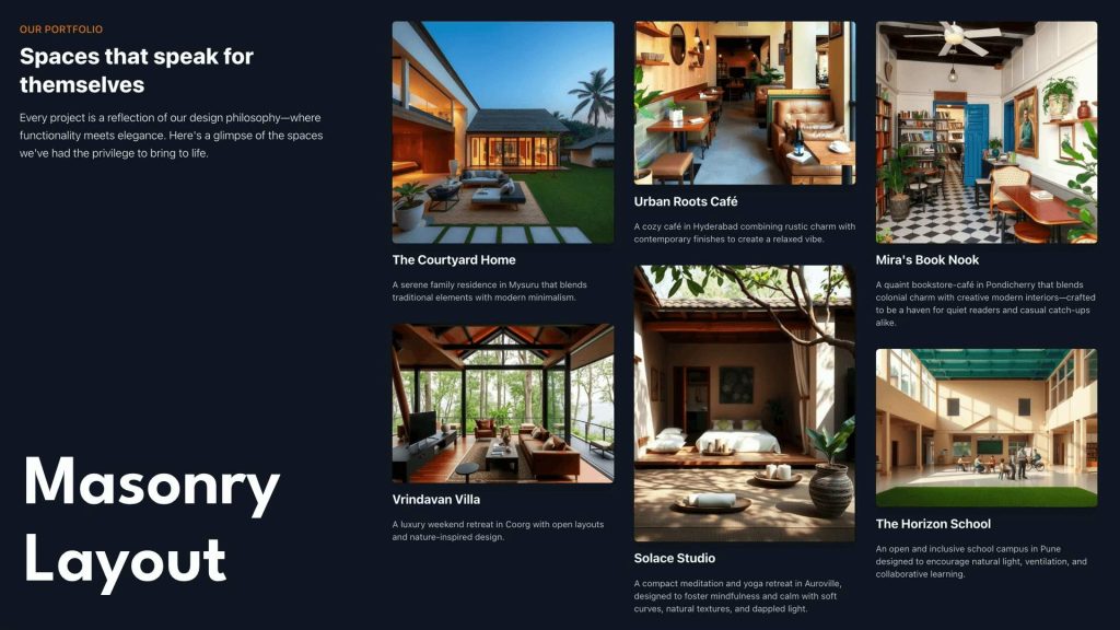
Simplifying the process of creating masonry layouts
Another key highlight was Shruti’s exploration of masonry layouts, a holy-grail design often associated with more complex JavaScript solutions. In a fluid and informative manner, she unveiled a CSS-only solution facilitated by Tailwind. “There’s a very simple way of doing this in CSS and Tailwind using columns,” Shruti explained. Through her use of utility classes like columns and breaks inside, she demonstrated how to easily achieve a clean masonry design without additional scripting, showing the potential of Tailwind’s CSS performance capabilities in the process.
Crafting flexible and modern designs efficiently
In a fast-paced development environment, Shruti’s talk emphasised the necessity of efficiency in design. With a focus on Tailwind’s dynamic utility classes, she encouraged developers to streamline their processes. “You can create responsive grid layouts with a single utility class,” she explained, introducing a tailor-made utility class that allows for customisable fractional values, thus removing the hassle of repetitive media queries.
Through skilled use of Tailwind’s features, Shruti illustrated a future where design could be not only functional but also striking and user-friendly. Her passion for the subject matter and her engaging approach provided insight into the balance of aesthetic and practical applications within modern web design.
To go further into her demos and examples, see the video recording of the session, along with slides for some rich detail. It contains a wealth of knowledge ideal for any developer seeking to refine their layout design skills with Tailwind CSS.