Before a patient meets a doctor, nurse, or receptionist, they face a simple challenge: finding the right place. At WebExpo 2025, Ladislava Zbiejczuk Suchá and Michaela Holubec Birtusová focused on hospital wayfinding as a systemic issue shaped by architecture, information design, digital touchpoints, and human behaviour. Their talk explained how getting lost in hospitals is not a personal failure but the predictable result of poorly designed systems.

Overwhelmed before being healed
Ladislava and Michaela began with what most patients already know: navigation in medical facilities is often chaotic, inconsistent, and stressful. Official signs compete with improvised notices, handwritten arrows, and outdated instructions, creating cognitive overload precisely when people are least able to cope.
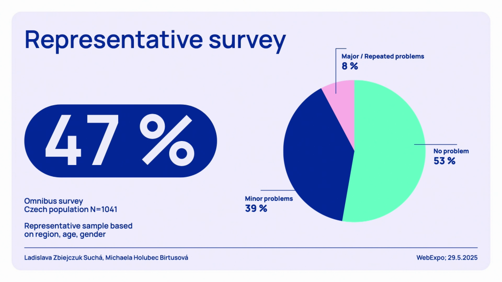
Survey results confirmed the scale of the problem. Nearly half of Czech citizens reported difficulties orienting themselves, with numbers rising sharply among older visitors. One respondent said, “I usually have my children with me. I’m old and I need a companion.” Another was blunter: “I wouldn’t have a chance at all.” These are not edge cases. As Ladislava noted, “There are strong emotions connected to this state. Stress, frustration, sometimes shame, even fear.”
The hidden cost of confusion
Beyond frustration, poor navigation actively undermines healthcare delivery. Patients arrive late, miss appointments, or begin consultations already anxious and exhausted. One participant described the result plainly: “By the time I found the ambulance, I was 45 minutes late.”
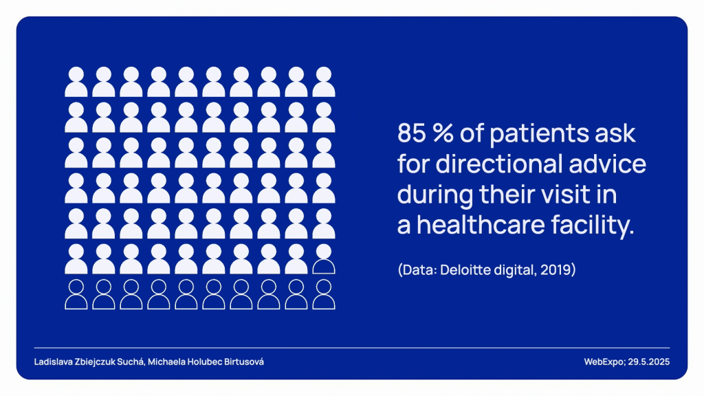
Staff feel the impact too, repeatedly interrupted to give directions or guide lost patients. Referencing international research, Ladislava remarked that “85% of patients ask for directional advice,” often from nurses or doctors already under pressure. In this sense, wayfinding becomes an invisible operational cost, rarely budgeted but constantly paid.
Research that goes beyond the signboard
What made this project stand out was the range of research methods used: surveys, accessibility walkthroughs, eye-tracking, website audits, and even immersive VR testing.
Eye-tracking footage captured moments of acute confusion, such as when two contradictory signs caused participants to reread them again and again. Some testers joked, “I really wondered for a while if it’s really working like that… that you have made some kind of escape game.” The experience might seem absurd, yet it mirrors everyday reality.
Crucially, the research extended beyond physical space. Hospital websites, often a patient’s first point of contact, were found to be inconsistent, text-heavy, and frequently unusable without prior knowledge. As Ladislava put it, the patient journey “starts at home,” long before anyone steps through the main entrance.
Designing with, not for, users
Instead of prescribing a single visual solution, the project fostered an iterative design process involving multiple studios, researchers, and users. Early concepts for maps, pictograms, and signage were tested with diverse groups, including elderly participants, people with disabilities, and those with ADHD or dyslexia.
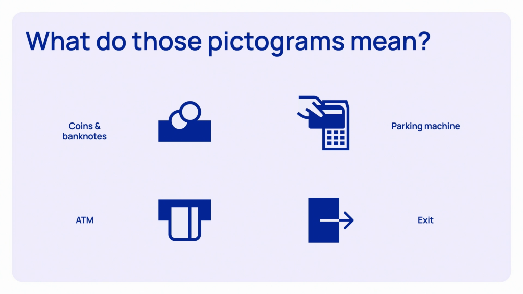
The results were humbling. Designers’ assumptions did not always align with users’ mental models. One clear example was pictograms: abstract or metaphorical icons frequently failed, while simple conventions worked best. As Ladislava observed, “The abbreviation ATM stands for the cash machine much better than any picture of credit cards.”
Michaela contrasted this user-centred approach with the traditional ad-hoc mindset: “They just manufacture the signs and put them where they think they should be.” It calls for a more sustainable model that invests upfront in research and testing rather than correcting mistakes for decades to come.
Wayfinding as a living service
One of the strongest messages from the talk was that wayfinding is never finished. Hospitals evolve constantly. Departments move, entrances close, construction disrupts routes, and patient needs change.
This understanding led to the use of virtual reality, allowing rapid testing of routes, lighting, and signage without bothering real patients. The goal was not just to select a final design, but to establish principles and guidelines that hospitals can adapt over time.
Why this matters beyond hospitals
The talk closed by widening the lens. Wayfinding “is not about signage… it’s a service.” It spans digital and physical touchpoints, human interaction, emotion, and trust. When it fails, people feel stupid, anxious, or unwelcome. When it works, it quietly restores dignity at a moment of vulnerability.
For designers, researchers, and public institutions, the takeaway was clear: improving patient experience does not always require new technology or grand architecture. Sometimes it starts by helping people find the right door without fear.
If you’d like to explore the full research methods and design process behind this project, you can watch the complete WebExpo 2025 talk Lost in the hospital: How (not) to design wayfinding for better CX and access the slides below.