Let’s be honest, inclusive design doesn’t sound like a sexy topic. But when Vitaly Friedman takes the stage, it’s a whole different story. For those who don’t know him, Vitaly is the creative lead and co-founder at Smashing Magazine and also works as a frontend/UX consultant for the European Parliament. In his talk at WebExpo 2024, he made us rethink everything we know about accessibility and shared best practices and techniques to craft truly inclusive experiences. Let’s dive into the highlights of Vitaly’s talk.

What even is accessibility
When we think of accessibility, many of us immediately picture a compliance checklist. But as Vitaly reminded us, true accessibility goes deeper than just ticking boxes. It’s about making digital experiences meaningful and usable for as many people as possible. 💡
The myth of the average user
Here’s the curveball: edge cases or average users don’t exist. Whaaat?! 😱 Yes, it’s true, each user is unique and has their own needs, requirements and limitations.
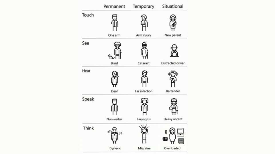
Every 6th person in the world has some form of disability. This includes not only permanent disabilities but also temporary and situational impairments. Microsoft’s Inclusive Design toolkit reveals how even short-term injuries or other circumstances may impact how people interact with technology – a broken arm isn’t just an inconvenience, it’s a whole new user experience.

Permanent, temporary and situational disabilities
Breaking down barriers
After building the foundation, Vitaly went into practical examples of often overlooked details that make design non-inclusive and how to fix those slip-ups. Let’s take a closer look at some of the challenges:
- Colour blindness
Around 300 million people have a certain degree of colour weakness or are colour-blind, which means you should never rely on colours alone to communicate information. Adding patterns, textures or other visual cues saves users from guessing.
- Motion sickness
Believe it or not, approx. 30% of the population gets dizzy from too many moving elements on a website or parallax scrolling effects. Vitaly’s advice? Respect the physics!
- Specific age groups
A very interesting part of Vitaly’s talk, with many eye-openers, was dedicated to the specific needs when designing for children and older adults. In brief, when designing for kids, you need to understand their motivation and mind the parent factor, on the flip side, when designing for older adults it’s important to simplify everything and design with empathy towards their experience with tech.
Accessibility at WebExpo 2025
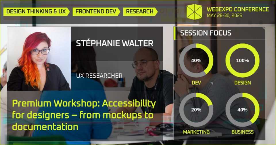
Are you ready for the upcoming European Accessibility Act? Stéphanie Walter, a well-known UX researcher and strategist specialising in inclusive design and accessibility will deliver a full-day Premium Workshop on May 30th at WebExpo 2025. Stephanie’s practical workshop is primarily for designers and project people who want to roll up their sleeves and produce best-in-class accessible mockups and improve team communication on accessibility. Learn more and secure your spot here.

Key takeaways
Accessibility isn’t just the right thing to do, it’s also a massive business opportunity. It opens the door to a huge audience you might otherwise miss. Next time when you sit down to design a website, ask yourself: Am I designing for the “average user” or everyone including permanent disabilities as well as temporary or situational impairments? And remember – even a small change can make a huge difference. 💪
Hit the play button below to get the full Vitaly experience. And if you love Vitaly as much as we do, grab your ticket for WebExpo 2025, as he’ll be there with his new talk and a full-day hands-on Premium Workshop. Stay in tune, more info is coming soon!