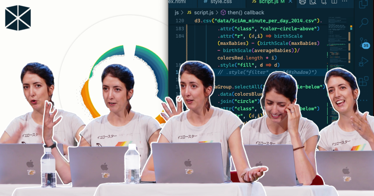
In her WebExpo 2025 talk, Nadieh Bremer set out to show the audience how a truly custom data visualisation comes together. No slides, no pre-rendered stages. Just a blank browser window and d3.js.
She introduced her approach simply: “I’m a data visualisation freelancer and I make visualisations that are a little bit more sort of creative and custom and really specifically made for that particular data set and goal.” That’s why she avoids default chart menus. “I don’t want to look at what available charts Excel has. I want to think about the data and the goals.”

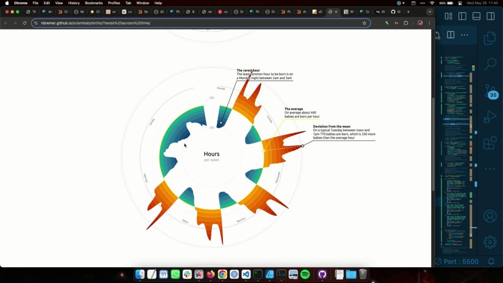
Turning a day of births into something readable
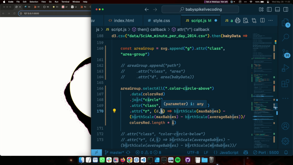
The dataset came from Zan Armstrong: the average number of babies born per minute in the United States. The structure was minimal and included a minute index from 0 to 1439, the number of births, and a pre-calculated regression line. Everything else was built live.
Nadieh began with the foundations: loading the CSV, converting values, applying the margin convention, and mapping the data with d3 scales. Each minute became a circle on a linear axis, revealing low activity around midnight and heavier peaks through the morning and early afternoon.
But as pointed out, midnight is “a very… human arbitrary cut in a day”. Since a day repeats, the visual should reflect that cycle. Using polar coordinates, she wrapped the timeline into a circle. “X is the radius times the cosine… and y is the radius times the sine of the angle.” Minutes turned into angles, births into distance from the centre, and the chart snapped into a rhythm that matched how we experience time.
Choosing the right baseline
Zero does not make sense here. “There’s no moment where zero babies are being born.” Instead of comparing everything to an irrelevant baseline, Nadieh added a circular line showing the average births per minute.
She then plotted the regression curve over the jittered points. It didn’t replace the raw data but clarified the broader trend, including a strong rise around 8 a.m. This spike is influenced by scheduled C-sections and hospital block planning.
Colour, texture and depth
With the structure complete, she moved to design. Nadieh had prepared warm colours for above-average values and cooler tones for below. Her first attempt used smooth gradients, but she discarded it quickly. “I wasn’t liking how smooth this looked.”
Instead, she created a layered effect from concentric circles clipped between the average line and the regression curve. The result resembled textured paper rather than a typical chart. Subtle SVG drop shadows added a sense of depth.
To keep the raw data visible, she placed the original circles back on top. They appeared white when sitting over colour and grey when outside. The clipping logic handled the switching automatically.
Anchoring the viewer
Around the outer ring, Nadieh built a time axis with 24 donut slices using d3.pie and d3.arc. Hour labels curved naturally with textPath, making the structure instantly understandable without needing to explain the geometry.
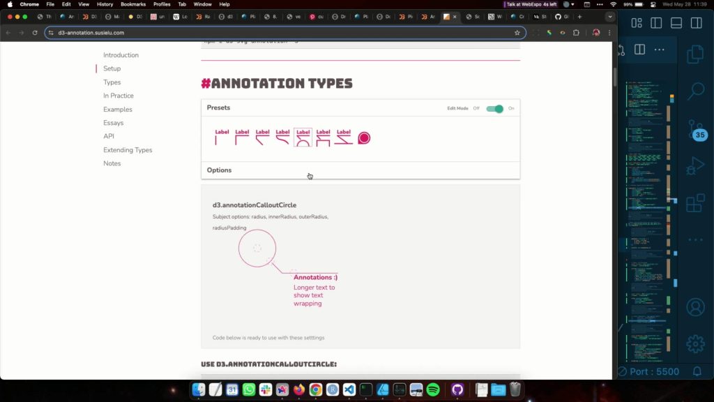
She closed with annotations using the d3-annotation plugin. “Annotations are so undervalued… less text is more, but that’s really not the case.” These notes highlighted the morning peak, the post-lunch bump, and the night-time dip, each tied to real behaviour in hospitals.
A rare look at the real process
Although the live demo took less than an hour, Nadieh reminded the audience that the original project took 25 hours of work. Iteration, abandoned attempts, and design experiments were all essential parts of the process.
For anyone interested in how data, maths, and design come together in real practice, the full recording and slides are available below.