

At WebExpo 2026, “The invisible design divide: Understanding layout between design and code” featured Christine Vallaure exploring one of the stickiest sources of friction between design and development: layout. Not visual taste, not polish, not even tooling, but the mental models behind how designers and developers understand grids, spacing, resizing and responsiveness.

The problem is not the file, but the model
Here’s the familiar story: a designer creates a carefully considered Figma file and shares it with the developer. Then the developer replies with concerns about the layout approach. The designer is faced with a choice: approve something they do not understand, or admit uncertainty and ask for an explanation.
That moment, Christine suggested, is where better collaboration begins. Designers are often expected to stand confidently in front of developers, even when the technical vocabulary feels intimidating. The talk encouraged designers to see those gaps as an opportunity to learn.
This may sound odd, but in the talk when delivered with a smile, Christine recommended to think developers as “friendly fluffy dogs” rather than intimidating gatekeepers. The relationship improves when designers are willing to ask what is happening “on the other side of the table”.
Flexbox and the logic of parent and child
The first technical bridge was Flexbox. Christine explained that designers often begin on a canvas, moving elements freely. Browsers don’t typically work that way. Elements naturally stack, and CSS layout tools define how they are arranged and resized.
Flexbox was introduced through the relationship between parent and child elements. The parent container sets rules for alignment, direction, gaps and distribution; the children respond within those rules. This maps closely to Figma’s auto layout, though Christine cautioned that they are not identical.
She noted that Figma’s dev mode may show “flex everywhere”, but this should be understood as an approximation. Auto layout can reflect core Flexbox ideas of direction, alignment, gap, padding, fixed sizing, fill container and hug content.
The practical message was that designers who understand nesting will create files that translate more reliably.
When one dimension is not enough
The next phase moved from Flexbox to CSS Grid. Christine used a common responsive problem: cards wrapping into new rows, but not aligning as expected. This is where Flexbox often reaches its limit.
As she put it from a development perspective: “Flexbox is the one-dimensional layout tool, and we have two dimensions.”
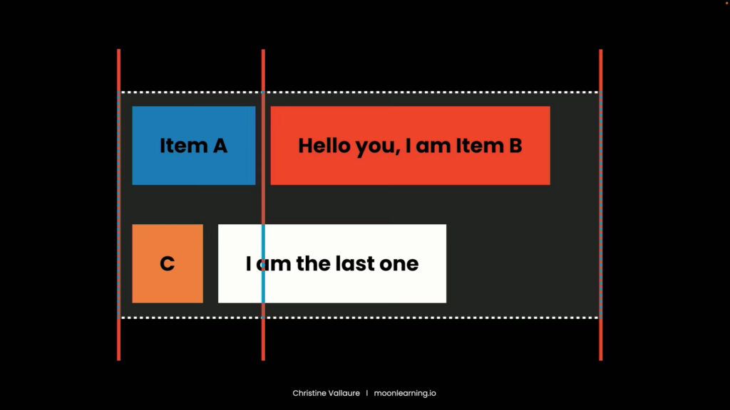
Flexbox behaves like beads on a string: excellent for arranging items in one direction and wrapping them when needed. CSS Grid behaves more like a bento box or chessboard: it allows placement across rows and columns, with cells, areas, overlaps and explicit positioning.
Christine highlighted a major source of confusion: designers often hear “grid” and think of traditional column guides. Developers, however, may mean CSS Grid: a much more powerful layout system based on grid lines, cells, fractional units and areas.
Figma now includes more grid-like layout features, including fractional units, but again the message was that Figma doesn’t implement this exactly the same. CSS Grid can do far more, including subgrids and implicit grids, and many browser-native behaviours cannot be perfectly mimicked in a design file.
Responsiveness is more than breakpoints
Christine then moved into responsive behaviour. Breakpoints, she explained, are thresholds where a design decision changes. In CSS, these are often handled with media queries, but modern layout is no longer limited to fixed framework breakpoints.
Designers may prepare different Figma frames for desktop, tablet and mobile, and define typography styles for each. That is useful, but it does not fully capture what happens in code. CSS also offers features such as `clamp()`, where typography or spacing can scale smoothly between minimum and maximum values without relying on breakpoints.
This matters because designers frequently expect resizing to behave exactly as shown in static frames. In reality, the best responsive behaviour often happens between those frames, inside the browser.
Container queries added another layer. Unlike media queries, which respond to the viewport, container queries respond to the size of a parent container. Christine described them as especially powerful for component-based design.
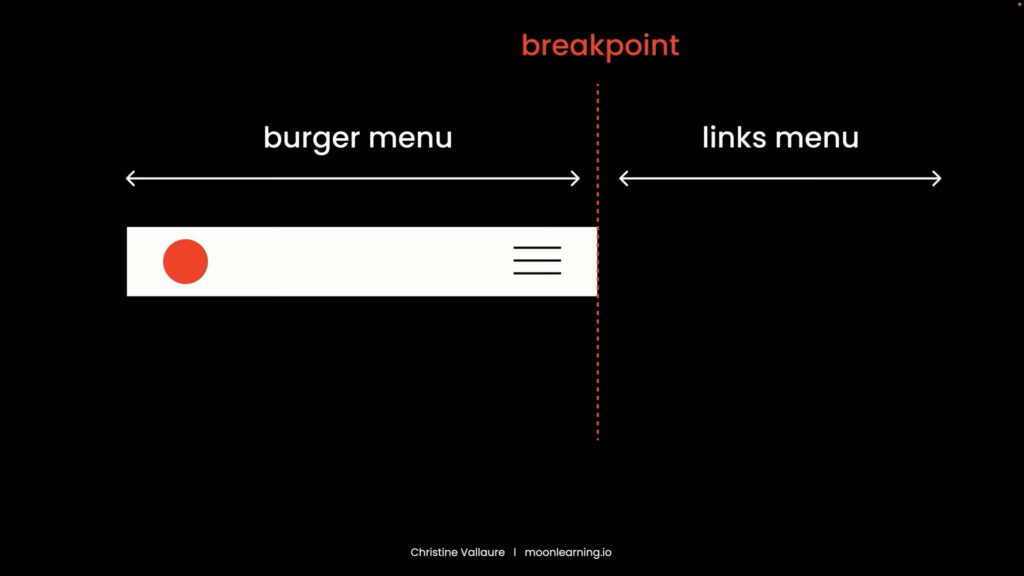
A component can adapt differently in a sidebar than in a wide content area, even on the same page. Figma cannot fully express this yet, but designers can still communicate intent by showing min and max states, documenting behaviour, and collaborating with development on implementation.
AI makes understanding more important, not less
The final section addressed the “elephant in the room”: AI. Christine did not treat AI as a shortcut around layout knowledge. Instead, she argued that AI makes that knowledge more important.
With tools such as Figma MCP, Claude, Cursor and agentic design systems, design files can increasingly be read and acted upon by agents. But agents do not have the same contextual judgement as a developer filling in the gaps.
“The agent is not going to ask me at the coffee break or on Slack if I maybe thought this and that would be a better solution to use a container query”.
If the Figma file contains unclear structure, approximate layout, weak naming, missing context or undocumented responsive decisions, an AI system may simply translate the ambiguity into poor code. The old gaps between design and development do not disappear; they become automated.
Christine also warned against flattening front-end craft into whatever an agent can easily generate:
“CSS is beautiful. It really is, and it is the craft. When we talk about craft and we talk about art in UI design, this is it.”
Figma covers only part of CSS: if teams rely only on what can be directly represented in the design tool, they risk losing the richness of the browser.
Shared understanding is the real deliverable
So, what’s the best way to get on the same page with Christine and have a shared understanding? Well, that would be to see the recording with visual comparisons between Figma, Flexbox, CSS Grid and container queries. The video and slides are just a little further down.